Round one saw mostly blowouts, but did have some intrigue. Now it’s time for the semifinal round in our battle of the ISL logos.
As a recap, we’re giving you a chance to vote for the best logos among the 8 inaugural International Swimming League (ISL) franchises. We started last week with round one of our randomly-ordered bracket. Now, the four winning logos move on in what should be much more hotly-contested battles.
First, a recap of last week, complete with some of your feedback from the comment section:
Round 1 Review
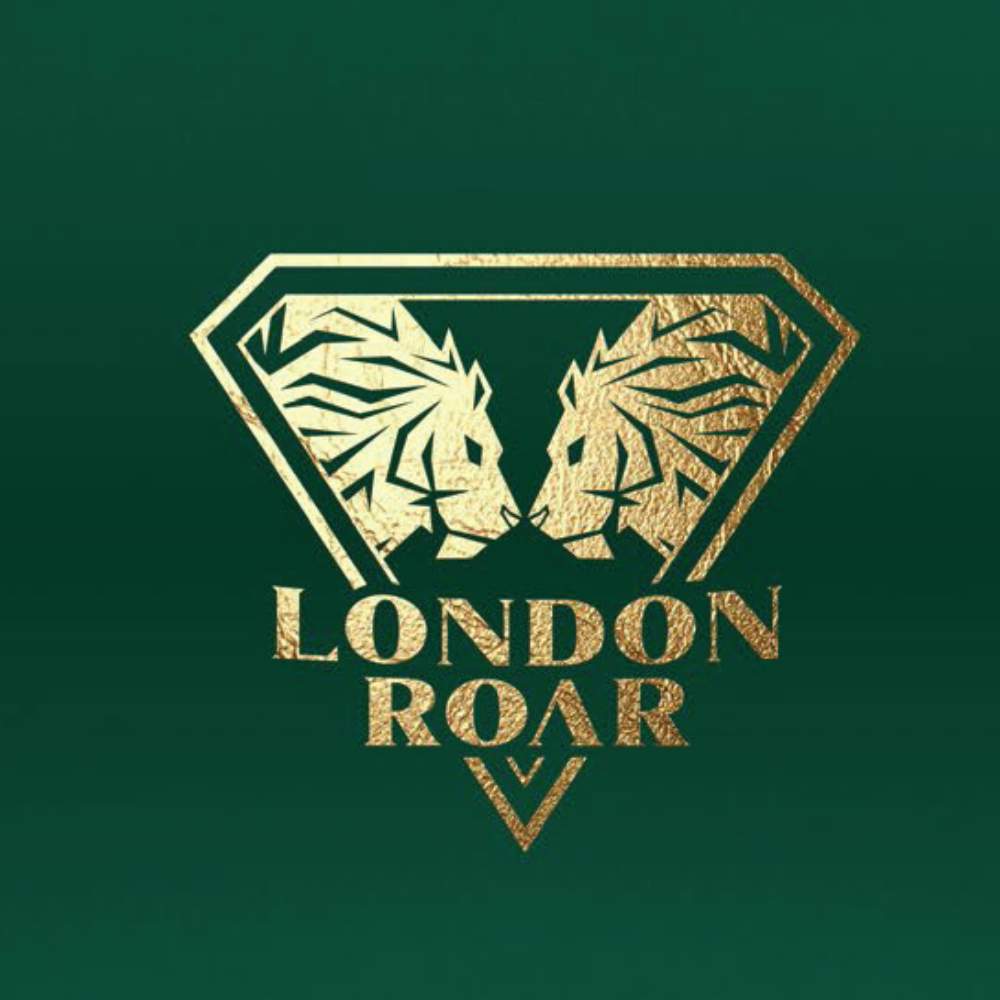
London Roar (90%) over Energy Standard (10%)
This one was the biggest blowout of round 1, and pretty much everyone could see it coming. Two cool golden lions against… some sort of misshapen beetle?
The Roar logo is pretty cool, and got some of the rare positive feedback from comments on the last poll post. It’s also very on-brand (a team called the “Roar” whose mascot is an animal who actually roars? What a novel concept!), and it probably benefits from having a completely unique color scheme compared to the other 8 franchises – every other team at least roughly shares its main color with another franchise.
Energy Standard is the only club that is essentially already an established brand, so it makes some sense it would roll with the logo already in use by the Energy Standard Group and the Energy Standard swim club. The color scheme seems a little off though. Orange and blue can look cool together, but this orange is somewhere between orange proper and salmon, and it just doesn’t pop, especially next to the more eye-catching red of a rival ISL team.
Here is some of the best comment section feedback we got on these two:
- “Energy Standard looks like a rising tech startup lmao” – Swim Dog
- “The weird thing about the Energy Standard logo is that on the one hand, it only makes sense if you speak Russian (Standard in Cyrillic starts with a C, so it’s like a stylized EC)… but then it still doesn’t make sense in Russian because the E is backwards (since it should be an Э).” – Barry
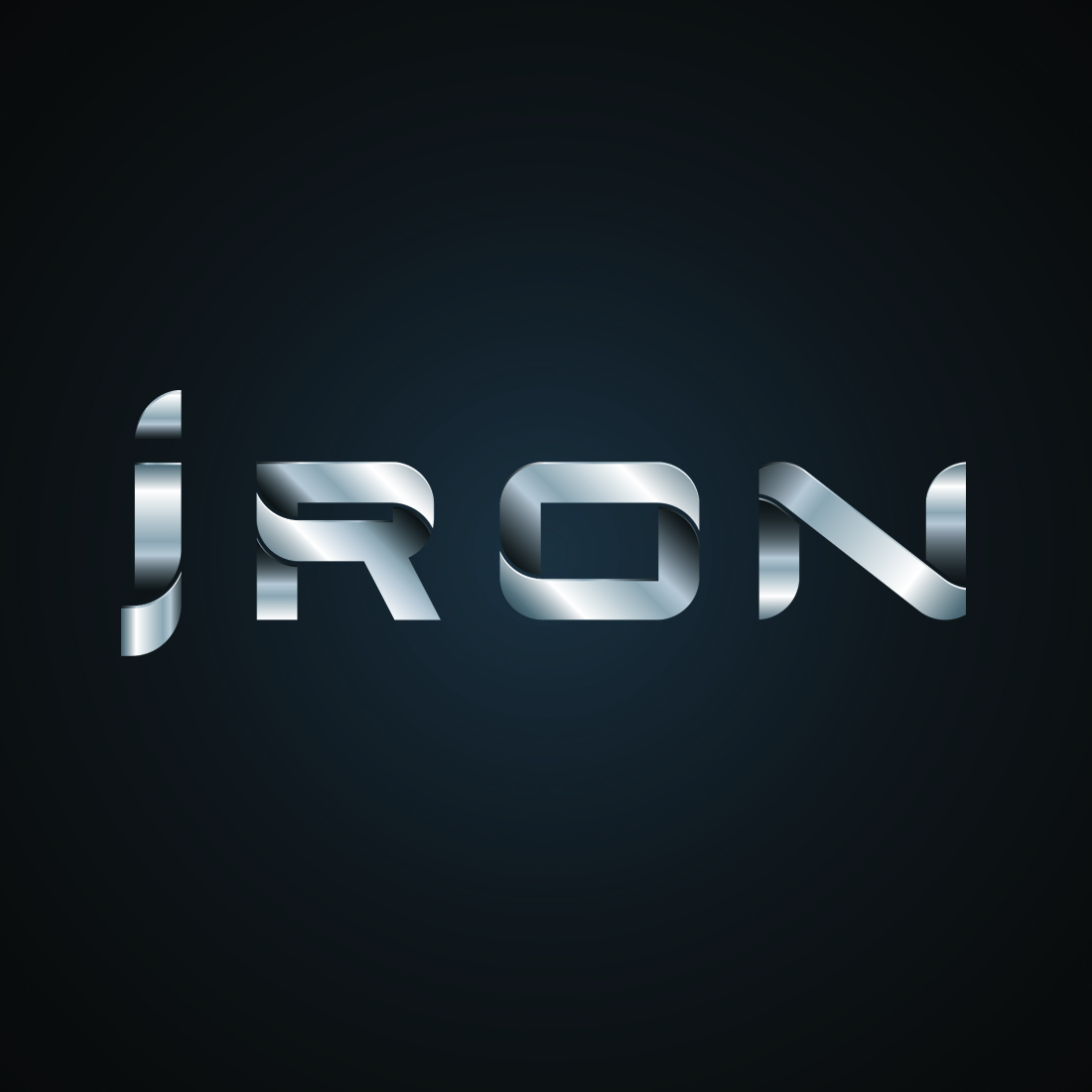
DC Trident (58%) over Iron (42%)
Next up is the closest of our round one matchups, and also the matchup with the most total votes. (How did people vote for this one and abstain from the other three? We don’t really understand how ballot fatigue works, but it’s a proven concept).
We could also call this one the matchup of mixed concepts. There’s not really a cooler mascot than a shark… but if that’s the goal, why not just be the Sharks? The Trident logo is a shark who is sort of wearing a crown that sort of looks like a trident, which feels like a pretty tenuous connection. On the other hand, the trident/crown itself looks cool, and we like how they stylized the “i” to look like a Trident point. Maybe the shark will take on more significance in the team’s companion comic book?
Side note: the logo we were provided by the league includes “silver” and “red” in the file name, and we’re inclined to think this logo could be cooler if it committed more to the silver idea – right now, it looks more red-and-white than anything.
Iron makes use of what has to be the coolest color scheme in sports: black and silver. I mean, who doesn’t love the colors of the Oakland Raiders or the LA Kings, even if you’re not a fan of those teams? The Iron logo mostly stays on-brand, too – sort of. The letters are definitely supposed to look like twisted metal, but they look equally like free-floating silver ribbons. We’re also sort of conflicted over the name. Originally, it seemed like the official name would be Team Iron, but now it appears per social media and the logo that the team will just be known as “Iron.” That mononym thing could be a cool way of branding, but it’s also a little bit clunky to use in a sentence (“Iron signs superstar butterflyer” sounds like a bunch of metal has become sentient, and “I’m an iron” sounds like a team member is saying their mascot is a wrinkle-removing device).
More from the comment section:
- “The Trident logo is…. a shark? WTH?” – Wondering
- “DC Trident Logo looks too age grouper-ish. I can’t do any better so I am not one to talk.” – Swammer
- “The Trident looks like a summer league logo.” – Well
- “The rest looks like either age-group teams or even worse, company logos (looking at you team IRON’s hardware store…) – Not the Frontman of Metallica
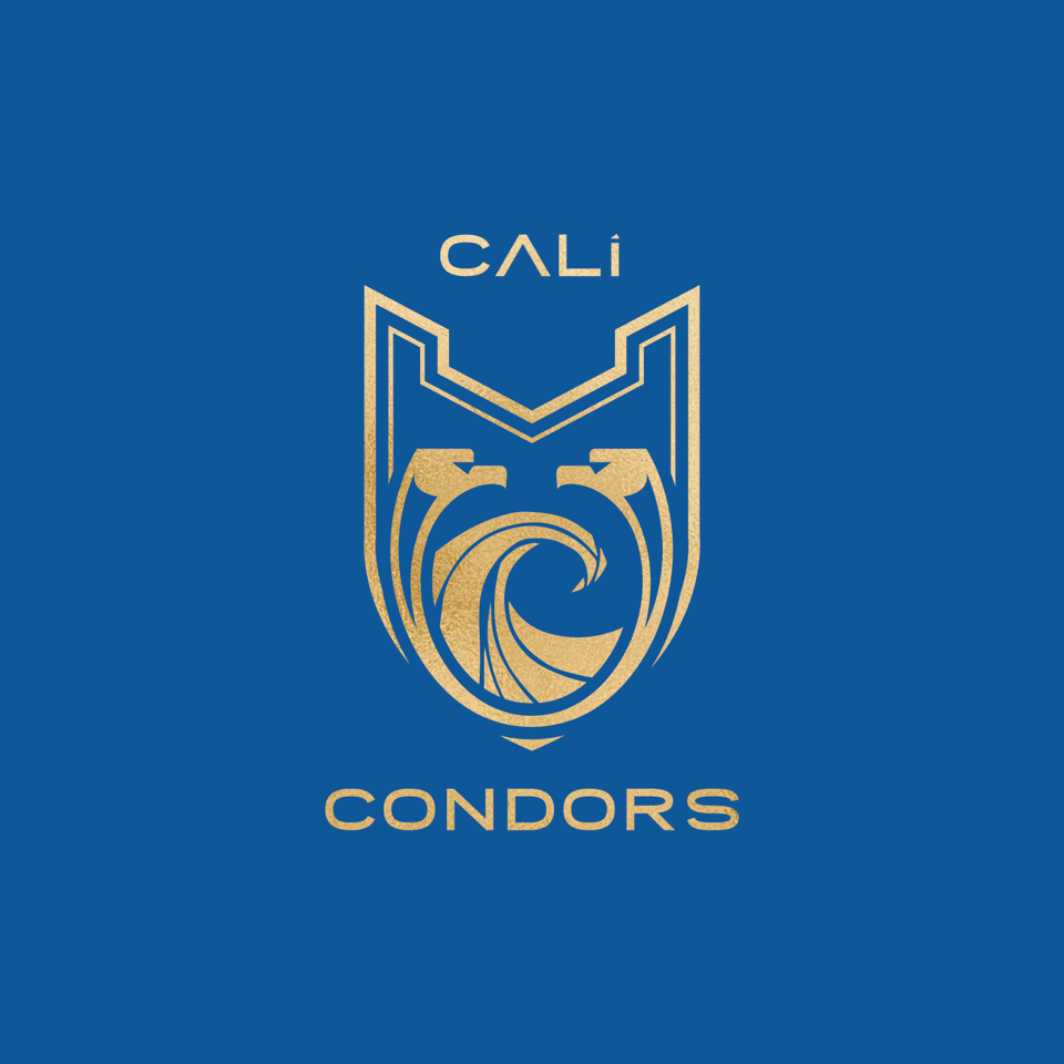
Cali Condors (72%) over LA Current (28%)
An all-California matchup got some of the more positive feedback all-around, but a sort-of classic-looking Cali Condors logo triumphed over the more cool/modern LA Current.
The Condors logo does kind of have a soccer feel, as pointed out in the comment section, but that is probably a positive for more people than not. The color scheme is on-point: blue and gold are great colors, and they hit the shades just right. That’s really important in a league where 3/8 logos are mainly blue. A minor quibble is that the condors in the logo are pretty hard to pick out as birds (especially in the black-and-white version), but in the inclusion of wave is a nice aquatic touch. The font on “Cali” could go either way. Half the time, I think it’s really cool; the other half, it looks like a preteen typing “cΔLi” on Tumblr.
We’ll come out and say it: the format doomed the LA Current logo more than anything. It’s the only logo where we couldn’t use the logo the team is officially using on its social media. The Current is almost exclusively using its logo with yellow lettering and a blue swimmer/lightning bolt, but at the time, we only had logos with white backgrounds and that yellow lettering was almost impossible to see (see here). We’ve managed to dig up a version with a blue background (you can see below) that probably would have done better – though it’s still a tough sell to beat the Condors. That said, the Current logo still has some issues – chief among them, that it essentially mimics a recently-relocated NFL franchise that currently ranks near the bottom of that league in fan support. If you’re going to piggyback a brand in your own city, this one in particular might be a questionable choice.
On the positive side, the swimmer approximating a lightning bolt is a cool choice, and does stick to the team’s mascot better than most of the teams in the league.
More from the peanut gallery:
- “Cali Condors has the only really beautiful logo in my opinion” – Not the Frontman of Metallica
- “the Condors looks like a soccer team logo.” – Well
- “LA Current logo isn’t bad” – Swammer
- “The rest looks like either age-group teams or even worse, company logos (looking at you… AQUA CENTURIONS/ENERGY STANDARDS/LA CURRENT’s Tech consulting agencies)” – Not the Frontman of Metallica
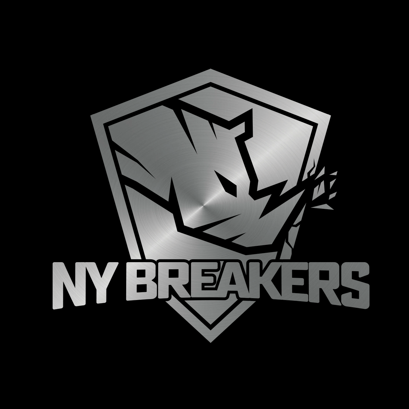
New York Breakers (61%) over Aqua Centurions (39%)
Another fairly close one here. The New York Breakers took over late here, after things looked very tight in the early goings.
The Breakers probably have the coolest logo here, but have to fight the fact that it’s frustratingly off-brand at every turn. A league with two California-based franchises, and the one named after essentially a surfing term is from the surfing mecca of… New York. Yet that franchise is owned by a California-based family (who, to their credit, do have a well-documented surfing connection) and will compete in their home meet in… Dallas Texas. And then the logo is a rhino, rather than a wave, which is more a philosophical exploration of the vast connotations of the word “breaker” than it is a unified brand. (A lot of this is maybe why only one of the four European franchises lists a city or country in its official name or logo, despite each club roughly having its own protected recruiting territory. These clubs are better viewed as floating “brands” unconnected to one specific area than they are a representation of the culture of one city, state or country).
That longwinded gripe aside, New York Breakers GM Tina Andrew herself actually weighed into the comments section of our last post with an explanation of the rhino that does make a lot of sense (and which is very on-brand for the Andrew family as a whole, even if it requires some explanation to get there). She writes:
“The Rhino, indigenous to South Africa (where [husband] Peter and I are from) and in African culture, is a totem for power, agility, and unconventional behavior. We thought this really fit our beliefs as a club and wanted to emphasize especially the latter of those in the symbolism of the Rhino breaking through the shield. They are thick-skinned, fearless, and resilient, and that has symbolized our own personal journey to this point and we really think that it also resembles the character of the athletes we have on our team and want as part of our team.”
On to the Aqua Centurions, who picked a nice shade of blue and really emphasized the empty space in their logo. The blue and white is a generally good color scheme, but it, like the LA Current logo, may not have shown up as well on our white-background poll page than the more colorful and eye-catching logos. The Centurion helmet itself looks cool from a distance, but a little confusing up close. It looks like there’s supposed to be some sort of double-message going on, like the Current’s swimmer/lighting bolt, but it’s not apparent what the second feature is. It might be a swimmer (the ridged part looks a little like a diving torso, and the face part of the helmet like legs pushing off a starting block?), but it’s really unclear. A Centurion helmet is a cool enough concept. Just going with something like a Michigan State or a San Jose State would be tried-and-true – why make it something more abstract than that?
Again, the commenters weigh in:
- “Aqua Centurions logo is the worst in my opinion. Looks like a default title page of Microsoft PowerPoint.” – Thomas
Round 2
It’s on to round two – the semifinals. Per some feedback, we’ve updated our bracket to use larger logos from each franchise. We’ll also run a consolation poll, with the four losing logos all competing together:
Updated Bracket
![]()
Interestingly enough, all four eliminated logos had a color scheme competing with one of the winning teams: the LA Current and Aqua Centurions were both blue like the Cali Condors, Energy Standard is red-orange and similar to the DC Trident, and Iron has the same silver/black combo as the New York Breakers. That means we now have four competing logos with very different main color schemes: green, red, blue and black.
London Roar vs DC Trident
![]()
Which ISL team has the better logo? (Semifinals)
- London Roar (72%)
- DC Trident (28%)
Cali Condors vs New York Breakers
Which ISL team has the better logo? (Semifinals)
- New York Breakers (51%)
- Cali Condors (49%)
Consolation Bracket


![]()
Which ISL team has the best logo? (Consolation Bracket)
- LA Current (38%)
- Iron (29%)
- Aqua Centurions (27%)
- Energy Standard (6%)
Personally, I just that the Cali condors logo is just too good. I’m a euccer for that beautiful blue and gold, and I think that the logo looks sick and futuristic. I feel like it could be any company, but when you look at is closer the Cali Condors logo makes so much sense being a swim team
When can we get more information about the meet itself instead of this nonsense?
Interesting to read the explanation of the rhino – but it still doesn’t work for me. If I tell my masters buddies, “Hey, you guys swim like rhinos!”, a beatdown will ensue.
LA currents diver doesn’t use his hands to pull off the block lol.
London and NY actually have logos I would wear on a shirt
When will the ISL start selling tickets? They were supposed to go on sale in July according to their website
The answer is still “none of them”
Bro these are all just so bad