2020 WOMEN’S B1G CHAMPIONSHIPS
- Swimming & Diving
- When: Wednesday, February 19th to Saturday, February 22nd | Prelims 11am | Finals 6:30pm (6pm Saturday)
- Where: Campus Recreation & Wellness Center, Iowa City, Iowa (Central Time Zone)
- Defending Champion: Indiana University Hoosiers (1x) (results)
- Live Results
- Streaming: Big Ten Network
- Championship Central: here
- Fan Guide
- Estimated NCAA Invite Times
- NCAA ‘A’ Cuts
- Day 3 (Friday AM) Heat Sheets
Data compiled by Barry Revzin
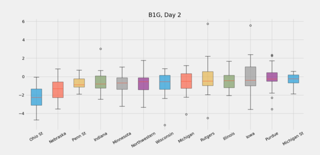
The data supports what the eye sees at the 2020 Women’s Big Ten Swimming & Diving Championships: the Ohio State Buckeyes are dropping time all over the place, which has allowed them to take the lead after 2 days of competition.
Team Standings After Day 2:
1. Ohio State University 561
2. Michigan, University of 478
3. Indiana University 338
4. Wisconsin, University of, Madi 257
5. Northwestern University 242
6. University of Minnesota 235
7. Purdue University 202
8. Iowa, University of 168
9. Pennsylvania State University 161
10. University of Nebraska-Lincoln 158
11. Rutgers University 135
12. Michigan State University 111
13. University of Illinois 108
More than half of the Ohio State individual swims on day 2 of the competition improved over seed time by at least 2%. That’s the best median improvement rate in the conference by almost double. Michigan’s median swimmer, meanwhile, has improved over seed time by less than 1%, while Indiana falls somewhere in the middle (though an early relay DQ is keping them well back in the standings).
In fact, every Ohio State individual swimmer on Thursday improved their seed time on Thursday in 32 entries (with 2 loopholes: Sarah Sperber didn’t have an entry time in the 200 IM, and Laura Banks, who swam breaststroke in the 50 free). That’s a rare feat at this level.
While the Buckeyes were expected to have a good day 2 of competition (it feeds into their team strengths), if they continue to perform the way they did on day 2, the meet could easily turn into a runaway in their favor.
Nebraska, which sits in 10th place after 2 days of competition, and Penn State, who are a slot ahead of them in 9th, are having the next-best performances compared to seed. They were tabbed pre-meet by the Swimulator to finish 9th and 6th, respectively.
In the charts below, negative (lower) boxes are bigger drops, while higher positive (higher) boxes are smaller drops (more on the chart methodology at the end).
Chart Explanation: The charts represent improvement percentages versus seed (season best) times. The colored box is the middle 50% of swimmers, so those ranging from 25th% to 75th% (the inter-quartile range) on each team, with the black lines extending from the box (the “whiskers”) being essentially all-but-outliers. Bigger boxes and longer lines indicate more variation in a team’s improvement versus seed. The red line in the middle of the box is the improvement of each team’s median swimmer. Teams are ranked from left to right based on the improvement of their median swimmer.


This title was not needed. Bucks are on fire
Even when SS writes nice things about them, the Bucks still whine.
I guess some teams need to focus on the negative to excel. Wouldn’t be a fun way to go through college for me, but to each their own.
And i presume you know exactly what is going on behind closed doors and what is being said in meetings, I-O?? I’d have to guess no one is whining right now 😉 but hey you can keep looking for negative things!
Don’t @ me