Organizers of the upcoming Paris 2024 Olympic Games and Paralympics have unveiled the pictograms that will be used to represent, in brief, each of the sports that will be a part of the event.
See the video below for a fun hype video of the Pictograms:
The idea behind the Paris 2024 Pictograms is that the design will “elevate them from mere visual aids to striking coats of arms serving as rallying cries for sports fans.”
Which translates for the rest of us to ‘more merchandise sales’ and ‘broader branding via social media shares.’
The 2024 logos mostly incorporate an X pattern, sometimes explicitly, and sometimes implied (as in artistic swimming).
Pictograms were first introduced to the Olympic landscape in 1964 for the first Tokyo Olympic Games. It was in 2021, back in Tokyo, where the Pictograms really took on a life-of-their own, literally, as organizers unlocked the marketing potential of the symbols. The pictograms in Tokyo were a star of the opening ceremony, with actors dressing in navy blue and white costumes and acting out the pictograms live, which was one of the highlight moments of the opening ceremony.
There are 62 pictograms in total for the Olympic and Paralympic Games, including 5 for aquatic disciplines (Olympic and Paralympic swimming will use the same pictogram).
Aquatic Pictograms
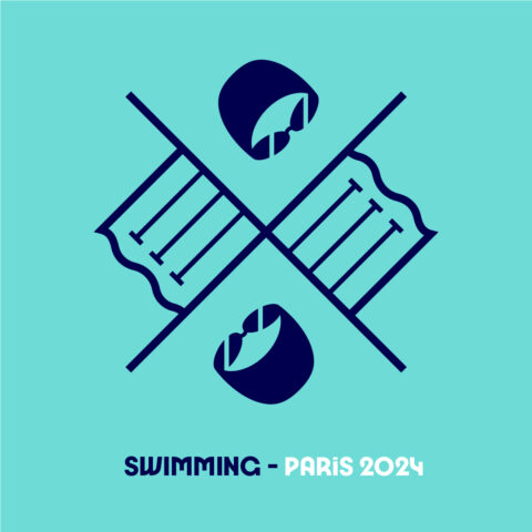
The pool swimming pictogram features a rotationally-mirrored image of one-half of a three-lane pool, recognizable by the familiar Ts, and a cap with goggles, implying a swimmer’s head peaking out over the water.
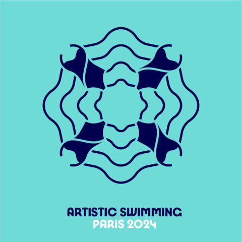
Artistic Swimming features a rippled wave with the X created by four women’s swimsuits. This clues in that the pictograms were likely finalized before the recent approval of adding men to synchronized swimming events for the Paris 2024 Games.
The diving pictogram features a 10-meter platform and 3-meter springboared above water, mirrored on the opposite side of the coat of arms.

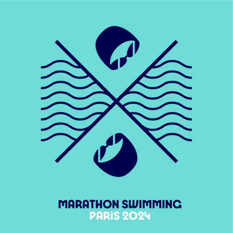
Marathon swimming, also known as open water swimming, includes the same swimmer cap-and-goggles seen in the pool swimming logo, but with waves instead of lane ropes. This is an interesting choice, because in other pictograms, waves have been used to depict pool water, but here, they’re used to differentiate open water from pool water.
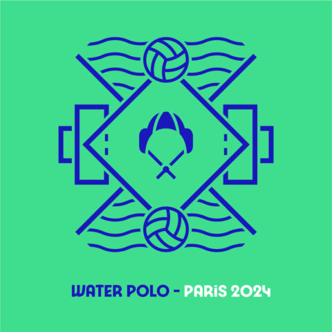
Water polo’s pictogram uses waves (back to waves for the pool, not open water) and a pair of water polo balls. The water polo balls have the same design as the volleyballs used for the volleyball pictograms, which actually makes sense, because for most of the two sports’ history, the balls had similar design (if different materials). Ironically, neither sport’s balls are actually paneled the way that is shown in the pictograms anymore.
All I see is terrorist nations welcome
swimswam sue them! they stole the idea of caps and goggles as a swim logo idea!
Is that swoopy “2/4” thing the main logo, too?
I don’t hate it, and the pictograms are sorta nice, too. (Not that I’ve ever noticed the pictograms before.)
The only logo I really remember is the London one, which do not think about Lisa and Bart Simpson while looking at it.
they were clearly inspired by the SwimSwam logo lol
Clearly