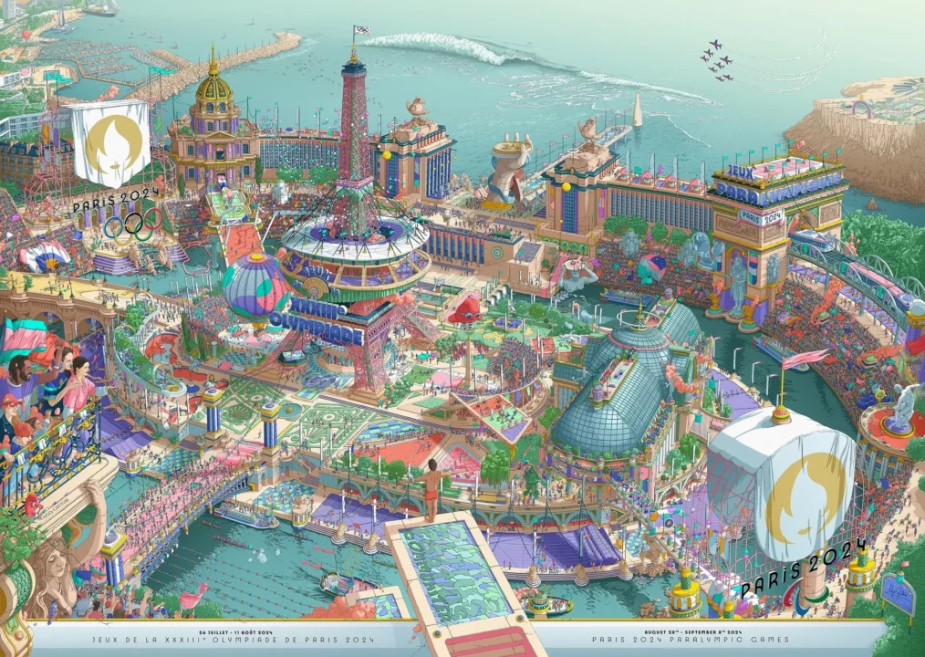
Organizers of the 2024 Paris Olympic and Paralympic Games have unveiled the official art poster for the upcoming global events, and they stand in stark contrast to ones we’ve seen in other recent Olympic Games.
The poster is a two-part interpretation that attempts to pack the entire Olympic celebration, including sports, opening and closing ceremonies, venues, and iconography, as though it was all taking place around the center of Paris, the famed Eiffel Tower.

In a clever twist, showing the bond and unity between the two events (which are technically run by separate organizations), the poster is actually two posters that, when stuck together, make a single panoramic image.
This allows the image to be sold separately in portrait orientations or spliced together in fun ways for different landscape orientations.
The description reads:
“A picture’s worth a thousand words, here are the 2 iconic posters of our Games: one Olympic and one Paralympic.
Together, they form one big story, that of #Paris2024“
The image was at first jarring in its deviation from past art posters which have relied on simple patterns and minimalism.
The poster ushers in the new design trend of “maximalism” says Janna Schulze, who works at a Philadelphia-based communications firm.
The Paris Olympics poster design is so fun—it’s ‘Where’s Waldo’ meets classic Parisian Art Deco style, inviting you to pause and explore all these little details. We call this design trend “maximalism,” which embraces the feeling of abundance. It’s a total departure from the clean and modern design trends we’re accustomed to in the digital space. It feels nostalgic and fresh at the same time…calls to mind summer afternoons spent people-watching at a Parisian sidewalk café.
True to intention, the Paris poster is full of ‘easter eggs’ and other hidden gems, evoking the 1990s cultural phenomenon Where’s Waldo.
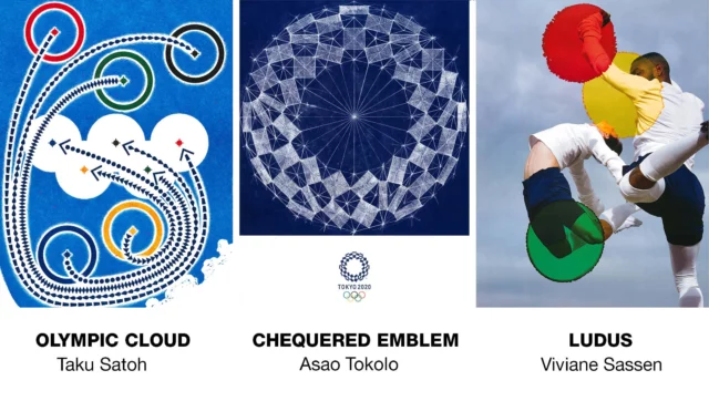
Tokyo published 20 different art posters, most of which were abstract or minimalist. A few examples are below.

Rio too relied on simplistic and symbolic posters, capturing the minimalism that dominated the 2010s thanks to the likes of Japanese author and organizational specialist Marie Kondo.

Maximalism is perhaps the more fitting of the opposing forces for the Olympic and Paralympic narrative. While the Games themselves have become obsessed with simplifying and removing complexity as an existential matter, the reality is that the Olympics by definition are a maximalist event – athletes from all over the world, playing sports that vary as widely as golf and rugby, with athletes that range from Olympic gymnast Simone at 4’8″ tall to Iranian sitting volleyball player who is 8’1″ tall (and the third-tallest living man in the world).
Everywhere you look in the Paris poster, there’s something new to find, a new sport, a new activity, a clever new way to mash things together. Just like in the Olympics, around every corner there’s a new story, a new journey, and a new perspective to share.
The Paris 2024 poster represents the greatness of the Olympic Games in the most chaotic and fitting way possible.

I absolutely LOVE this poster! I have never been tempted to buy an Olympic poster before, but I’m going to buy this one!
As an art in itself, it’s probably good in the eyes of many people (art is subjective anyway).
But as an art that represents modern Olympics, it’s odd.
I love it
The comments are controversial for this poster in France. Nothing characterizes the Olympic motto “Citius, altius, fortius”. It feels more like an amusement park or a carnival. I won’t buy it.
Vraiment moche!
Truly ugly. . . .
Why not add the kitchen sink and the garbage pail to this monster of a poster?
Augury: This poster is a pastiche of how badly run the Paris 2024 Olympics will really be: glitter, not gold!
When will this poster be sold
Starting today in the Paris 2024 online shop, at the 7 shops around Paris, and at the Musee d’Orsay: https://www.paris2024.org/en/shop/
Hmmm. I can’t find Macron in the Seine anywhere…