Did the cancellation of March Madness leave you with a bracket-shaped hole in your life? Then have we got something for you.
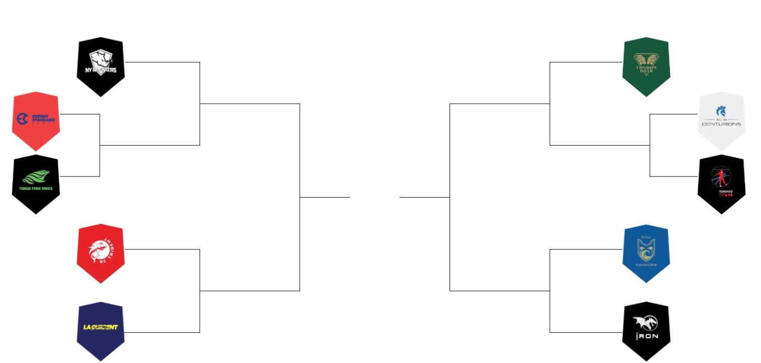
We’re bringing back a popular series from last year – a reader poll bracket for the best ISL team logo.
For the 8 returning franchises, this is a rematch of last year’s bracket challenge, albeit with a few twists. Iron has a brand-new logo in a year-two rebrand. For the others, the distinction between primary and secondary logos are more clear, and we’ve got standardized logo shapes via the ISL website.
This year’s bracket also mixes in two brand-new franchises. To create a working, 10-team bracket, we’ve seeded the returning logos based on their finishes in last year’s bracket challenge. The bottom two finishers (Energy Standard and the Aqua Centurions) will face the two new logos in what are effectively “play-in” matches in the opening round.
Leave your analysis of the logos and matchups in the comments section, and if it’s clever enough, you just might see it in our next-round story.
All Ten Logos For 2020
The Bracket
Round 1 – Play-Ins
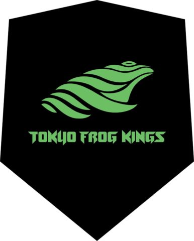
Energy Standard vs Tokyo Frog Kings
Which ISL team has the better logo? (Play-Ins)
- Tokyo Frog Kings (82%)
- Energy Standard (18%)
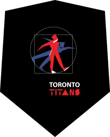
Aqua Centurions vs Toronto Titans
Which ISL team has the better logo? (Play-Ins)
- Aqua Centurions (62%)
- Toronto Titans (38%)





NY breakers
I actually don’t understand how Toronto’s logo ended up that horrible.
I’m going to buy all the frog merch they’ll sell me.
Tokyo king frogs and Toronto titans
frog kings have the best logo this year IMO
The Titans one is so bad, that it’s good. I think I might want a T-shirt
Might as well give the bracket to the frog kings now!
Centurion wins over titan. Titans have to much going on and no cool colors or logos. Aqua Centurions have a cool logo and the white background stands out against the other teams