
The Budapest-based IRON club of the International Swimming League (ISL) has unveiled a new logo ahead of season 2 of the league.
The team, managed by Dorina Szekeres and fronted by Olympic champion Katinka Hosszu, finished 5th overall in the 2019 ISL season. Among the 4 teams that did not qualify for the finale in Las Vegas, Iron was the best team by some margin.
“We felt our last logo was a bit incomplete, so we were looking for a powerful image or figure to add to it,” Szekeres says of the upgraded look. “Now we feel this one perfectly captures the team’s identity.”
IRON has been unique in its branding for a few reasons among ISL teams. For one, they one of only two remaining teams in the league without a city and nickname pattern to their club identity.
Last season, the champion club was Energy Standard, which this offseason has rebranded itself as “Energy Standard Paris.” While the branding is new, the club has always been technically based out of Paris. This has led to some confusion among the public, given that the Energy Standard training group, that preceded the team in the league and where many of the team’s athletes train, is based in Turkey.
Aqua Centurion, based out of Italy, also doesn’t have a geographic designation in its official team name.
We don’t yet know the branding of the team from Tokyo (or much about the team at all, aside from its connection with Olympic gold medalist Kosuke Kitajima).
While fans of American sport are likely more familiar with the “city/nickname” nomenclature, in European professional sports leagues this is less common.
The other anomaly for IRON’s branding is that they previously did not have an image-based logo. In season 1, IRON’s logo was a stylized metallic version of the word “IRON.” The new logo features a dragon, which gives the whole feel of the brand identity a big Game of Thrones vibe.
The background of the new logo almost feels like denim, though a video animation of the logo shows the intention maybe of a dragon’s scales as the background.
Like all of the team logos in the league, there’s a lot of texture and color fading in the ‘electronic’ version, though that has to largely be stripped out for anything printed. This bucks the trend of logos of professional sporting leagues globally, which by-and-large have shifted to simple schemes for their logos, usually employing no more than 2 or 3 colors, both in print and in electronic display.
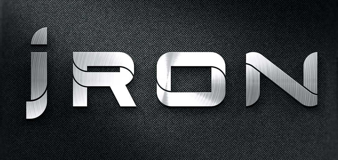
The change has also simplified the word-mark on the logo a little by dropping the tail that was previously used on the ‘i’.
Other animal-based teams in the league include the Rhinocerause of the New York Breakers; the Lions of the London Roar; the Condor of the Cali Condors; and the shark of the DC Trident. The Toronto Titans and Tokyo teams have not unveiled their logos yet; LA Current and Aqua Centurions used humanoid-based logos; and Energy Standard has a stylized E as its main logo.
New Logo
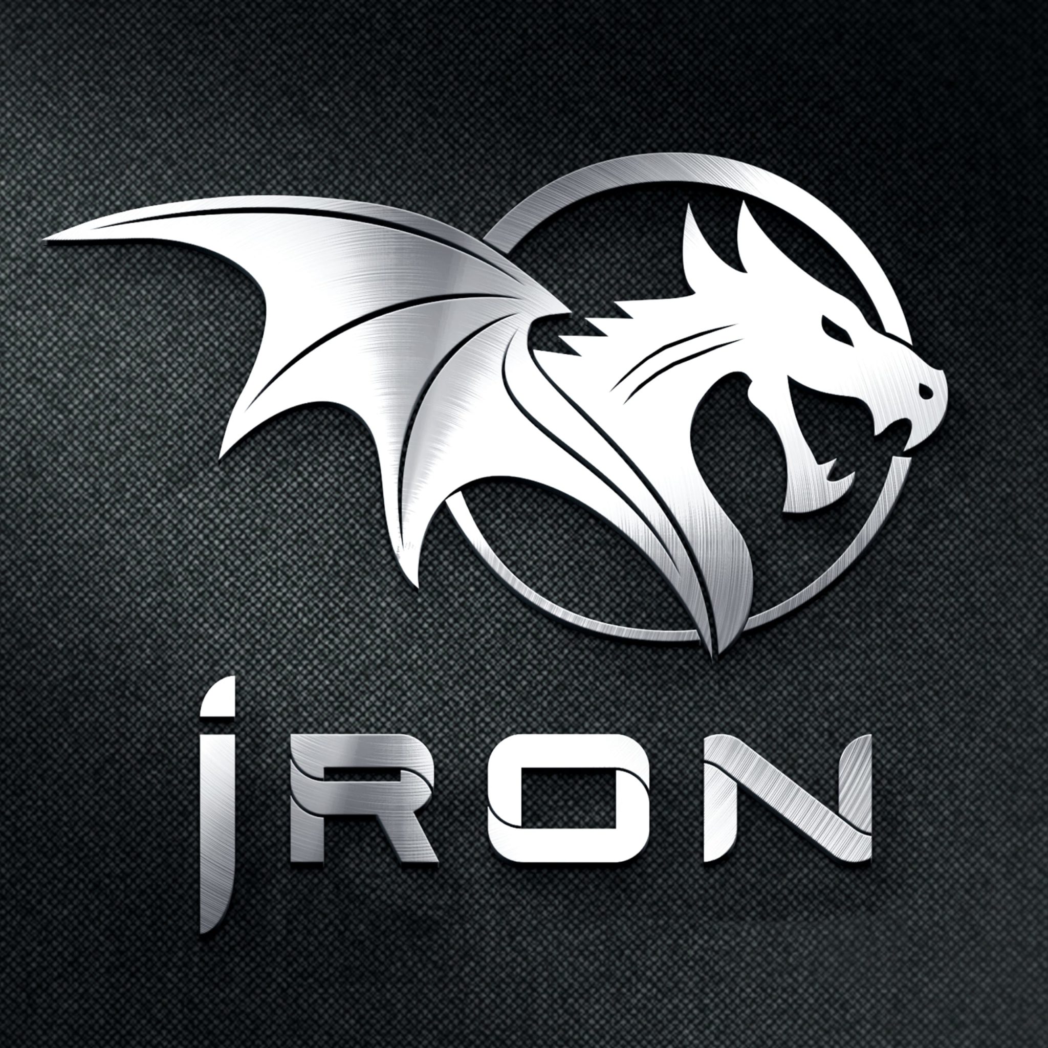
New IRON Logo, beginning with the 2020 ISL season
Old Logo
The team’s old logo
Animation:
Looks like the name is JRON, sounds like som medioker rapper…
Dracarys…
Probably one of the best logos in the league now
This logo is cool as heck! I want it on a hat that I can buy!