With last week’s reveal of the Paris 2024 Olympic and Paralympic brought lots of marketing hype around the world, as organizers push the branding of the upcoming Games with descriptions of a new era in pictograms.
The Paris 2024 Pictograms certainly do feel different than any other we’ve seen before. They’re a little more complex, generally, and have a more specific-feeling identity than past Olympic Games. Unlike basically all pictograms before them, the Paris 2024 pictograms largely omit humanoid figures (though some are implied, like the swimming logo).
While organizers would surely like us to all feel as though “all pictograms are created equally,” I have opinions.
In total there are 70 Coats of Arms for the Olympic and Paralympic Games; 9 of those (including pool swimming) are identical for the two events (though the official site says 8 – if one of the 9 I’m looking at are different, I’m having trouble perceiving those differences).
So that makes 61 unique pictograms. And I’m going to rank them all.
My criteria:
- General visual appeal
- Good design fundamentals
- How well the pictogram represents the sport
- Agnostic to the sport itself, how likely I would be to buy a shirt with that pictogram on it
- Consistency/logic in the pictogram
I tried to ignore color, because I assume that all pictograms will be available in all colors.
The head of Paris 2024 said that the goal was to “break” from the literal images of sports, and try to rethink the idea of the pictogram. While noble to a degree, the pictograms still have a function to communicate to the audience what a sport is.
Warning: aquatics did not fare well. Here we go!
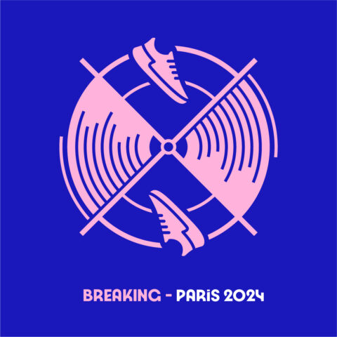
1. Breaking (Break Dancing)
This logo achieves exactly what the Olympics are trying to achieve when adding breaking (break dancing) as a sport. It’s modern (in that it’s retro – which is very modern right now), it’s hip, it works in the idea of the spinning and the record into the logo. I love this logo. I think I will buy this shirt.
2. Wheelchair Fencing
A nice upgrade to the regular fencing logo, adding the chair, but without losing what’s cool about the fencing logo.

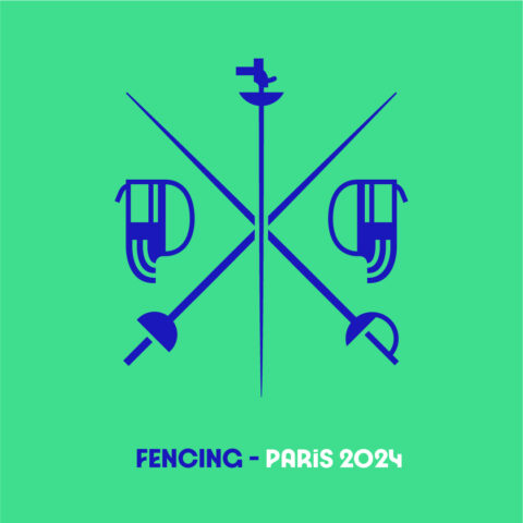
3. Fencing
Nailed it. The swords are the perfect tool for the coat of arms vibe, and incorporating the foil, épée and sabre into the logo was a subtle but nice touch. I would definitely buy this shirt.
4. Surfing
This is a cool logo. They could roll this out as a brand ID today and sell a few million dollars worth of merch in coastal surf cities in the next 12 months, even without the Olympic connection. Guarantee you that Tom Shields and Michael Andrew will buy this shirt.

5. Weightlifting
Simple, clean. The barbell is cool. This should’ve been the model for some of the other ones where they tried to jam too many elements in. And it fits the X pattern they were working hard toward.

6. Archery/Para Archery
I like this logo. It’s clean, it’s classic, you know what sport it is (probably), and I’d buy this shirt. I think they could have done a little better to make the target look like a competition archery target, but it’s probably more marketable to the public this way. I think this did the best of any pictogram in capturing the “coat of arms” feel that designers talked about. Good logo.

7. Boxing
I’m a fan of the way they did the ring and the ropes here, and it’s one of the few where the mirror-image makes a lot of sense. I’d buy this shirt for sure.

8. Para Powerlifting
This one is cool. I like the way they’ve stylized the barbell and weights. I would buy this shirt.

9. Wheelchair Rugby
A cool sport, and maybe the best of the “X on the court” logos. Something about that chair in the middle, a theme across many logos, anchors these for me.

10. Boccia
Of all the sports, I think this maybe did the best of incorporating essentially all of the elements of the sport but without feeling too busy. I don’t think it necessarily achieved the “coat of arms’ look, but I think it’s well-representative. How do we feel about the bocce and pallino being the same size?

11. Wheelchair Basketball
Similar to the basketball logo, but with the distinct angle-wheeled chair used in the sport in the bottom.

12. Basketball
I like this logo. It’s clean, it’s clear, and the symbolism is immediately recognizable. I don’t think I’d buy the shirt, because I don’t like the way the rounded three-point line rubs up against the X, but it scores high marks in most categories.

13. Badminton/Para-Badminton
The iconic shape of the shuttlecock is really well-presented here. This design holds true to the X/coat of arms vibe they were going for in (most?) of the logos. I think the speed lines and breaks in the net are a little busy and could have been cleaner, but overall I like the design. Would probably buy this shirt. If they made the logo JUST one big shuttlecock, I would definitely buy this shirt.

14. Shooting/Para Shooting
A target with a bullseye. It’s simple, it’s clean, it’s pretty good. It’s got a good visual look overall.

15. Wheelchair Tennis
Every element of this is visually appealing, and they’re well-assembled. I think the two tennis/two chairs balance is better than the four tennis icons of the Olympic tennis pictogram.

16. Track Cycling
One of the most-thrilling sports on the Olympic schedule has a relatively-mundane logo, but it’s got a nice retro vibe so I don’t mind it. Feels like something you’d buy at Abercrombie c. 2003 trying to emulate something authentic from 1978.

17. Rowing
This one is pretty cool. It’s clear what it is, well-differentiated from the other boating events, and the logo does a good job of showing the idea of motion. I would buy this one.

18. Trampoline Gymnastics
I think they did better than Tokyo, where it was hard to recognize the difference between the diving logo and the trampoline logo. For trampoline people, this is a clearly-identifiable image.

19. Taekwondo/Para-Taekwondo
I like how smoothly the athletes’ shoulders move into the octagon (which is the shape of the competition arena in Taekwondo). Could’ve done without the squaring of the matt on the left and right sides, but overall it’s a good logo.

21. Para Rowing
Similar to the Olympic rowing logo, but a single. This probably could’ve just been another duplicated logo, but maybe there’s a subtlety to the differences between the two sports that drove them to make it different (para rowing has only singles, doubles, and quads, where Olympic rowing goes up to 8s, so maybe they thought it was better-represented by fewer oars?

22. Tennis
I like the way they’ve represented the rackets and balls here. They’re not overly-literal, but clearly recognizable.

21. Rhythmic Gymnastics
They got a lot of the equipment in there, and they took advantage of the sort of creativity and free-form allowed for by the ribbons. This is a good one, though it has a different feel than many of the rest of the pictograms.

23. Road Cycling
It’s simple. I get it. I think this is my favorite version of the bike. Solid logo, though it looks a bit like a traffic sign. Would buy the shirt.

24. Para-Cycling Road
All of the para-logos that are similar, but slightly different, from their Olympic peers are rotated 90 degrees. I think I like the Northeast/Southwest orientation slightly better than the Northwest/Southeast orientation. I don’t have a good reason why, though.

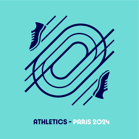
25. Athletics
This pictogram could have been a good lesson for gymnastics (further down in these rankings). Athletics includes track, field, the jumping events, the throwing events, race walking, the marathon, the steeple chase, the decathlon…a wide variety of disciplines with a wide variety of equipment. But they were able to build the logo down to the shoes that they have in common. I like this logo, and would buy the shirt.
26. BMX Racing
I think I like the way that the designers made (most) of the cycling events have essentially the same logo, just tweaking the details on the bike and helmet design. This helmet is distinct, and the clearance from the bike makes it less busy. I’d buy it.

27. BMX Freestyle
Upside-down bike, the distinct BMX helmet, I get it, I see it. I’d probably buy this one. I do think the orientation of the bike makes it a bit hard on the eyes, even though I like the idea behind it.

28. Cycling – Mountain Bike
Why is there no mountain in here? There should be a mountain. Or at least some kind of topography. I guess it’s implied by the bike being angled downhill?

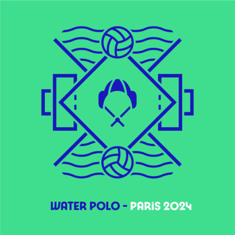
29. Water Polo
My favorite of the aquatic sports logos, I think it’s obvious what it is, it has incorporated many elements of the sport without looking too complicated, and I think it really captured the iconography of the sport (the cap with the ear protectors) well and made it front-and-center in the logo. If there’s one part of water polo that you cannot mistake for another sport, it’s that cap.
30. Judo/Para-Judo
There’s some cool stuff going on here. I like the style of the judogi (the uniform in Judo, and the incorporation of the inverted colors as a sense of the yin and the yang. I’d probably pick this one up in a store.

31. Sailing
Vinyard Vines, eat your heart out. It’s pretty good. I wouldn’t buy it, but I think a lot of people would.

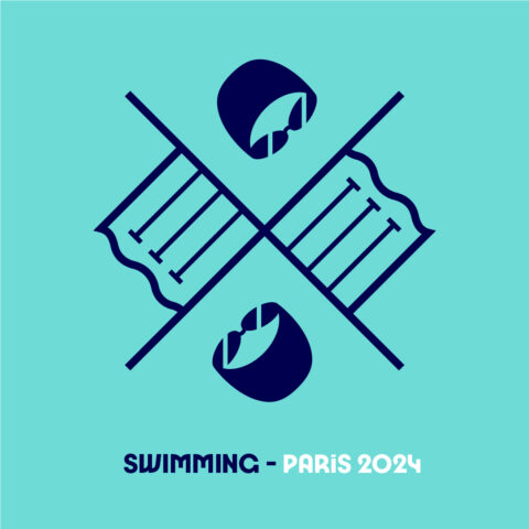
32. Pool Swimming/Pool Para-Swimming
The logo is simple. It’s clear what sport it is. I don’t think it’s particularly exciting, and I don’t know that I’d buy this shirt. But it’s not offensive in any obvious way, it’s just a bit bland.
33. Rugby Sevens
It’s pretty good. I would’ve just left out the dashed goal line, and the cross-mark on the center line, but that’s a minor quibble.

34. Table Tennis/Para Table Tennis
I have a lot of problems with the way they’ve depicted nets in these logos. I think this one could’ve worked with just a thicker line in the middle of the table. But it’s close.

35. Handball
I quite like the look of this one. They’ve eliminated the whole course and focused on the shape of the D-Zone, which is cool. I still can’t figure out why they’ve included the forced X in some logos and not others. I dig the look and would buy, though.

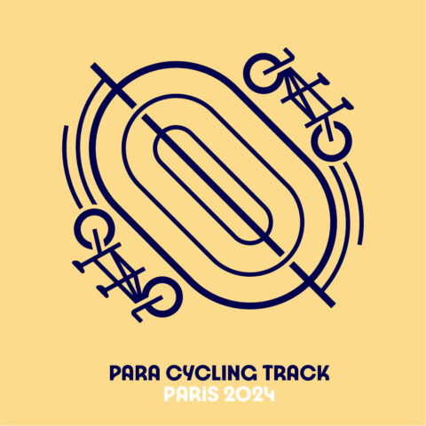
36. Para Track Cycling
A 90 degree rotation and the two seater bike (each visually-impaired cyclist is paired with a sighted cyclist) are the big changes from the Olympic version. But not all cyclists on the track are visually impaired. I think it could have been cool to put a two-seater on one side and a different version of the bike on the other, to be more inclusive.
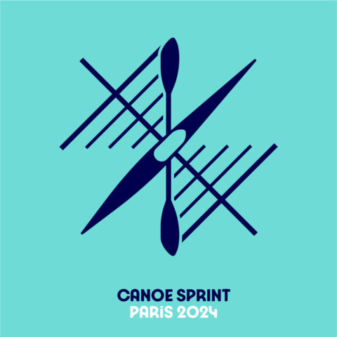
37. Canoe Sprint/Para Canoe (which includes Kayak)
This one is kind of cool, though it might not be clear for people who don’t know that the Olympic treat the sport of kayak as a subset of canoe.
38. Football (Soccer)
Like the big soccer ball in the middle of the field. Not sure how I feel about the X in this one, which I guess is supposed to intimate a grandstand? I’m sure there’s some deeper symbolism to this one, but I just don’t love it, and it feels a little forced/

39. Blind Football
It’s good. I get it. I can see that it’s soccer on a soccer field, but it’s still got some style (including the throw-in areas in the corners was a nice touch). I think much of the world isn’t familiar with blind soccer, but we can’t hold that against the sport – it represents the games iconography well, if you know the game (the sound marks are because the ball beeps). Solid logo – though I think it would have been cool for inclusivity if the organizers had come up with some sort of ‘audio’ branding for blind sports at the Paralympics.

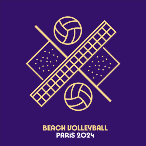
40. Beach Volleyball
This net representation will show up many times throughout these logos, and I wish they would have used a diagonal cross-hatch instead. When lined up next to the indoor volleyball logo, I get which is which, but I don’t think they’ve really done a great job of differentiating the two. I also think it’s odd that they used the “old school” volleyball pattern here, but a more modern volleyball pattern for indoor volleyball, when the neither sport actually uses that traditional paneled design at a high level.
41. Goalball
A spot in which blindfolded, visually-impaired athletes try to throw a ball (with bells in it) into a goal. It’s a lot of fun to watch. The logo, however, is a bit odd.

42. Hockey (Field Hockey)
This is kind of like a slightly-better version of the golf logo. I like it slightly better.

43. Para Athletics
A subtle change from the athletics one, replacing the running shoe with the blade worn by many amputees in athletics. Feels like maybe the blade isn’t as inclusive of all of the classifications present in athletics, so that’s a miss. I’d love to have been in the room to hear the conversation when they decided to orient this track on a 90 degree rotation from the Olympic athletics track.

44. Triathlon
Similar logo to Para-Triathlon, but I think for no reason other than visually, the fat-wheeled bike works better here than the recumbent bike in the para-Triathlon logo.

45. Para-Triathlon
A slightly-different swimmer than for the swimming events. The road on this one looks a little more hand-drawn. Again with the equipment that’s not fully reflective of the sport. But it’s pretty well-done, among the sort of multi-component sports.

46. 3×3 Basketball
Love this sport. Don’t love this logo. The logo in the middle is the proper branding for 3×3 basketball (see how it has both 3×3 and the bb for basketball?), which sort of sets it apart from most Olympic sports, which have more diverse sets of brands. I think it obscures the basketball half-courts though, making that confusing, and also is misleading because…there is only one half-court used in 3×3 basketball.

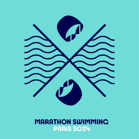
47. Marathon Swimming (Open Water Swimming)
I continue to like the cap/goggles look, but dislike the inconsistency of the water. Specifically, here, ripples are used to differentiate open water from pool water, but in other sports, those same ripples are used to indicate that the event is in the pool.
48. Wrestling
The singlets as part of the X doesn’t really work for me. I do like the mat. But would’ve been cool to just have a single singlet in the middle of the mat.

49. Golf
This feels like something that some people might buy. I don’t think I would. I see the greens with the pins and the holes, the balls, the stylized drivers. I get it all. And I see where they were trying to balance out the symmetry. and make it sort of a square. I think some version of this logo could be good. Just not this one.

50. Canoe Slalom
Why does that boat have a hole in it? Why are the waves broken up like that? Are those lines supposed to be the poles? Why does this logo have only an oar, whereas the Sprint Canoe pictogram has either two oars or a kayak double-sided blade? I hate this logo, and I think they would have been better-served showing the boat in profile rather than eagle-eye view.

51. Artistic Gymnastics
They sure did work a lot of elements of gymnastics into this one logo. With men and women having almost wholly-different event lineups, that was tough. While it’s kind of clever to get them all in there, Ultimately, it’s ugly, it’s too much, it doesn’t scream ‘gymnastics’ to me, and I would not buy the shirt. I think they should have tried to pick a simpler icon rather than jam everything in (but that was a theme for these multi-disciplinary sports).

52. Equestrian – Dressage/Para-Equestrian
Designers really had to stretch themselves to separate the equestrian events, which is why they had to incorporate words more directly into these pictograms. Probably could’ve been combined into one logo. The design of the horse has kind of an Egyptian feel to it. I’m not sure I’d recognize it as a horse if I didn’t have context. Perhaps the sport that is most-geared toward the “coat of arms” idea did not execute it well.

53. Equestrian – Jumping
The weird horse-head square again. I just wouldn’t buy any of these. Why have the horse heads in profile but the jump from above? I would’ve done the jump from profile too.

54. Equestrian – Eventing
This one looks like a 4th grader did it in clip art. Everything I don’t like about the dressage logo, but…worse. And no homage to the coat of arms.

55. Modern Pentathlon
This pictogram is a mess, but maybe that’s a fair representation of where modern pentathlon is right now. I find it interesting that while they’ve specifically omiteda gun from the logo for the shooting events, they’ve included it in the modern pentathlon logo. What happens if they finalize the shift of equestrian to obstacle course? A whole new logo? Do the shirts with the old logos become collector’s items? This just feels like someone threw a bunch of stuff on an MS Paint file.

56. Sport Climbing
I think one of the new Olympic sports could have had a clearer depiction in the pictogram. This is an example of where having to force into the X pattern really hurt the design, I think.

57. Volleyball
I know what’s going on here, but only because I know. I don’t know if I hate this more-or-less than the sitting logo. But I do hate it.

58. Sitting Volleyball
Not much that I like about this one. Looks like a skyline, and the ball is not discernible. I guess there’s one row of net because the net is shorter than Olympic volleyball?

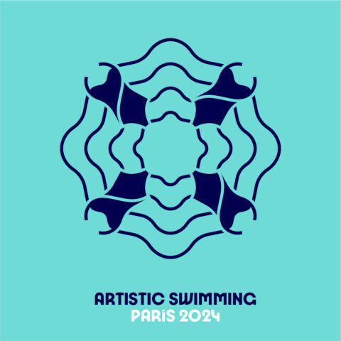
59. Artistic Swimming
I have lots of issues with this logo, the primary of which is that men will be competing in artistic swimming at the Paris 2024 Olympic Games, but the logo implies it’s still an all-women sport.
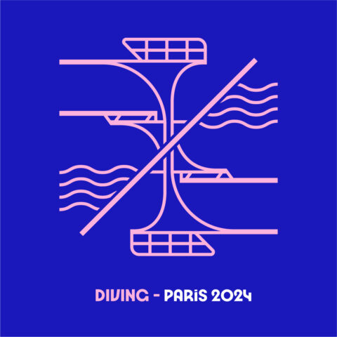
60. Diving
I think this logo is ugly, and I had to look at it for a long time before figuring out that it was the platform/3-meter flipped upside down, and not a platform/5-meter springboard/3-meter springboard/1-meter springboard.
61. Skateboarding
This logo does not feel like most of the others. I don’t know why some logos have the words in a circle versus an underline of the pictogram. I don’t know why they deconstructed the skateboard – The skateboard decks look kind of like bandaids, and the wheels look kind of like a Turkish evil-eye.

– Pararowing: I guess the reason for making this a single-rower boat was in order to include the pontoons as differentiation from regular rowing; these pontoons are used in Paralympic rowing for single racers, but not for multi-person boats.
– Modern pentathlon: A possible reason for including the gun here might be that it’s not an actual gun shooting actual projectiles, but rather a laser pistol to shoot at special targets.
You obviously put a lot of thought and effort into this. But I think you nailed it. Surfing, though, might deserve a notch or two higher ranking. Very cool.
these really didn’t need to be ranked. also, you should’ve added social justice as one of your criteria seeing as you insisted on analyzing enough of them through that lens
I’ve designed a few logos in my lifetime. And admired many others. I try to employ these three criteria either in my own design or choosing the ones I like:
1) simplicity in grasping the essential
2) ease of understanding what it’s representing
3) timelessness
The swimming logo (#32) fails in all three of my categories.
1) the bottom of the pool lines are ok, but the cap and goggles could beling to a welder or a surgeon. They could’ve picked something more essentially “swimming”
2) it took me 10 seconds to recognize that the things in the top and bottom quadrants were: cap and goggles
3) I wonder what swimmers from the 1972… Read more »
I feel like you put #3 in there just to satisfy your own “back in my day MAGA” fetish.
They’re all ugly lol.