
The United States has far and away dominated the top 100 world ranks in each event since 2010.. but do you know which nation has the second-most?
We’ve pooled all the data below, running it through a visualizing program to create a set of interactive maps, charts and graphs showing the top 100 world-ranked swimmers by nationality in every season since 2010. The idea was inspired by Robin PLA (@RobinRoad on Twitter), who collaborated with us on the project, and whose visualization you can see here. First of all, to better explain our data:
- The top 100 world ranks were pulled from the FINA database for each swimming season going back to 2010-2011. Each season started on September 1 and concluded on August 31 of the following year. That gives us 8 full seasons worth of data, and stretches back to the banning of the full-body supersuits in 2010.
- All ranks for all long course events and genders are included: that includes the 800 and 1500 frees for both genders and the 50s of fly, back and breast.
- Only long course meter events were included.
- The numbers are aggregated together to give a total for each nation. This is the total of top-100 ranked swims for that nation during that season.
Mobile users may want to open the interactive data in its own browser window by following this link.
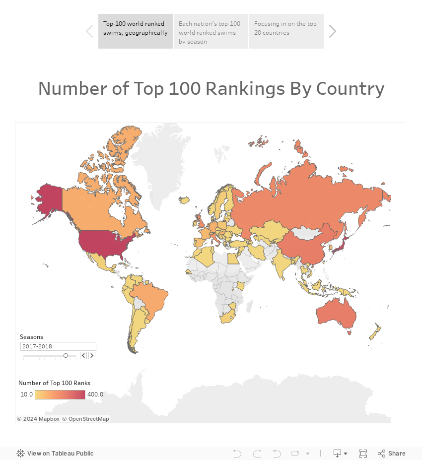
The first tab maps out the top 100 ranks by country. A yellowish color signifies a lower number, and the closer to red, the higher the number of top 100 ranks. Use the slider in the bottom left corner to advance year-by-year and see the changes. You can also zoom in on specific continents or regions.
The second tab shows the full numbers for each nation. Again, you can use the slider on the right side to advance year-by-year and see the changes.
The third tab focuses in on the top 20 countries in overall top-100 ranks over the past 8 seasons. A few of the nations included might surprise you. Once again, the slider at the top will advance the pie chart year-to-year, and the slider at the bottom will advance years on our flag graphic, which shows the relative weight of top 100 ranks by the size of each nation’s flag.
I don’t know what this statistics reflects actually but anyway my congratulations to Brownish winning against Bobo: 95 vs 84. 😀
🙂
oh Alaska….
😀
It would be interesting to visualize this per capita, to see where the fastest swimmers are coming from relative to population size.
Per capita wouldn’t be hard to do. But, even better – wish we could get a realistic sourcing of ‘competitive swimming population.’ While per-capita of population would be interesting to see which countries really love swimming, on a relative basis; per capita per competitive swimmer population would tell us which countries were doing the best at developing the athletes they get into world-class swimmers.
My guess is the Canadian women would rank pretty high right now, both per capita and relative to the competitive swimmer population.
What happens if you only count each swimmer once per year, regardless of how many events they ranked among the top-100? I mean Hosszu alone could possibly count for about 10 of Hungary’s annual top-100 ranks. 🙂