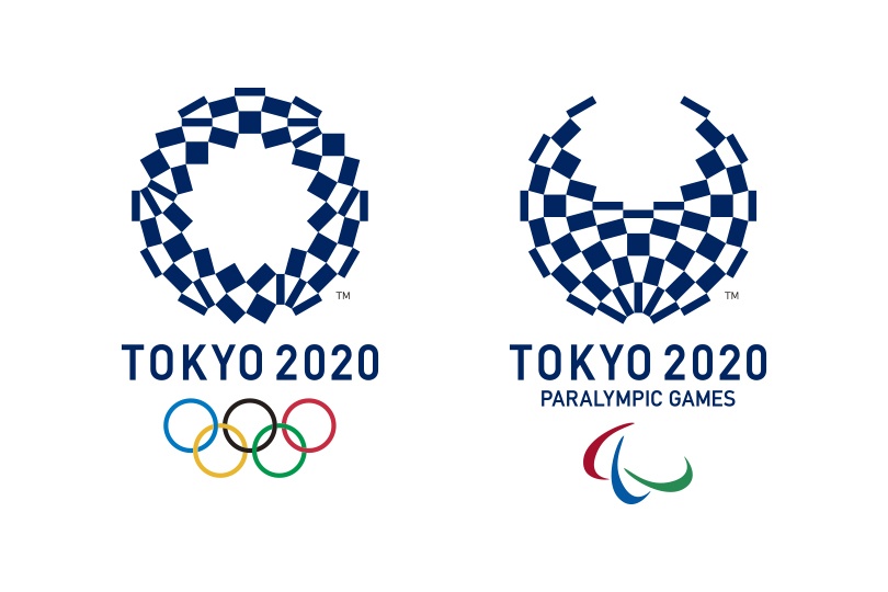
The new logo for the Tokyo 2020 Summer Olympic Games has been selected, putting to rest a series of complications associated with the process. Below is the pair of emblems now officially representing the Tokyo 2020 Olympic and Paralympic Games:
 As a result of the original Tokyo 2020 Olympic and Paralympic logo was officially withdrawn due to plagiarism concerns, last October organizers re-launched the competition to once again design the Games’ emblems.
A call for submissions was advertised, open to everyone, regardless of previous experience or formal qualifications. Stipulations of the designs included that the individual competition entries must come from Japanese Nationals who are at least 18 years of age, or foreign nationals of the same age minimum who have the right of residence in Japan. Children and non-resident foreigners could also submit designs via the group entry system (10 persons maximum), as long as one member of the group meets the aforementioned age, residential and nationality requirements.
The approximately 14,599 submissions were narrowed down to just 4 earlier this month.
The selected emblem’s creator is Tokyo-native artist by the name of Asao Tokolo, who incorporated a checkered pattern into his design. According to Tokyo2020.jp, in Japan specifically, the checkered pattern became formally known as “ichimatsu moyo” in the Edo period (1603-1867), and this checkered design in the traditional Japanese color of indigo blue expresses a refined elegance and sophistication that exemplifies Japan.
Tokyo 2020 organizers also presented the chosen logos as conveying a message of “unity in diversity”, as the various rectangular shapes within the symbols represent different countries, cultures and ways of thinking.
Of the newly revealed emblems, John Coates of the International Olympic Committee (IOC) Coordination Commission says, “The new Olympic Games Tokyo 2020 emblem symbolizes important elements of the Tokyo 2020 Games vision and the underlying concepts of achieving personal best, unity in diversity and connecting to tomorrow.”
“I congratulate the Tokyo 2020 team for the inclusive process that led to this selection. The public engagement in the selection process is another sign of growing interest in the 2020 Games,” Coates continued.
“Interest and excitement will continue to build, in Japan and globally, after the official handoff to Tokyo 2020 at the close of the upcoming Olympic Games Rio 2016. The Tokyo 2020 emblem will become a familiar symbol to people around the world.”

Unfortunate choice. Seeing that logo makes me think I’m at the finish line of the Indy 500.
They should have chosen Option D.
And here is your winner for the tritest sports comment of 2016. It goes to John Coates of the IOC Coordination Commission who greeted this insipid logo with this comment:
“The new Olympic Games Tokyo 2020 emblem symbolizes important elements of the Tokyo 2020 Games vision and the underlying concepts of achieving personal best, unity in diversity and connecting to tomorrow.”
What does this mean? It’s like Mr. Coates when to a list generator of things he was supposed to say, and that’s what he came up with. I don’t see any of Mr. Coates’ cliches… Read more »
What can anyone say about this logo whilst amongst a row of earnest Japanese Olympic men ? if there ever was a time for 1984 speak this is it . It is pretty dreadful but we must remain calm & impassive .Full marks to Coates -diplomacy is not his trademark but he knows this is not going to be so easy .
You say -at least this is not Rio – but have you seen the Japanese economy headlines?. It has been almost unfathomable for some time using traditional measures e.g. Debt to GDP but somehow their customary insulation is holding it up. Japanese citizens have to pay banks to deposit funds . With either TheDonald or Killary Japan… Read more »
Plagiarism aside, I think the new logos are much more aesthetically pleasing than the initial ones.