British Swimming has taken steps to revitalize their image and make their events more accessible to the British swimming fan.
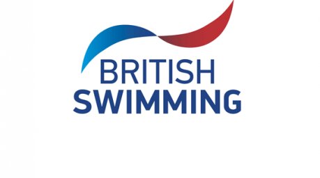
The new logo has been designed to embody all facets of their organization. The symbol represents all the aquatic disciplines – the motion of a swimmer through water, the entry of a diver, synchronised swimmers working in unison and opposing water polo teams. The colours consist of Union Flag red and blue with cyan symbolising water.
This new logo will be introduced in March at the FINA diving World Series and will be phased in throughout 2013.
In an attempt to make their swimming events more accessible British Swimming will use living streaming and social media to keep their fans up to date competitions. With the success of the first trial of their live streaming technology and format at the British Gas Diving Championships, they have decided to implement it once again at this year’s British Gas Diving Championships.
The national governing body has also taken the step to provide swimming fans with text, Twitter and Facebook updates throughout the competition.
One can only assume if the Brits experience another successful venture in broadcasting their events in this way it will become standard practice for their major events moving forward.
Even when I squint my chlorinated eyes, I don’t see the Waterpolo players or teams in that logo, without the headless guy holding a Waterpolo ball at the top right arm.