We’re on to the semifinals in our International Swimming League logo bracket, with just four franchises remaining.
Round 2 Recap


New York Breakers (55%) over Tokyo Frog Kings (45%)
It’s hard to call it a shocker when last year’s logo bracket champion wins their first round. But the overwhelmingly positive reception to the brand-new Tokyo Frog Kings logo had us thinking Tokyo might actually be the favorites to win the entire bracket this year.
The votes were quite close, and this was also the most-voted of the five round-2 polls by a very wide margin.
The Breakers have a few things going for them logo-wise. We noted last year that three of the top four finishers in the logo bracket were the only three animal-themed logos. And of the animal options this year (London’s lion, the Cali Condor, and Tokyo’s frog), the New York rhino is definitely among the ‘toughest’ and ‘coolest’, which are key adjectives for a sports franchise.
Our main gripe with New York last year was the leaps of logic needed to connect all the pieces. In an aquatic sense, ‘Breakers’ refers to surfing waves, but the logo itself takes a different interpretation with the rhino “breaking” the frame. Breakers has a lot of symbolism for the team itself, owned, coached, GM’d and captained by the Andrew family who are well-known for breaking the traditional molds of swimming training. And the rhino also speaks to the South African ties for both the Andrew family and the Breakers roster. While last year’s critique still stands – a logo should be a first-glance brand that really shouldn’t require a paragraph this long to explain – the poll results also show that a year in, fans do seem to be sufficiently looped in on the connotations of the Breakers brand.
Of course, it’s always worth noting that voting power among U.S. swimming fans on SwimSwam probably outweighs that of Japanese swimming fans, which is a potential complication to our bracket. The Frog Kings remain extremely popular (and per the comment section and social media, should sell a fair amount of merchandise), and we may just look back on this matchup and consider it the “true” final of the bracket – though there’s plenty more bracket to go.
A few reader comments:
- “I think that the frog kings versus the breakers is one of the best possible matchups. Love the green and black of the frog kings, but the breakers logo is just so good. I’ll give the edge to the kings because I like the colors over just the black and white theme.” -Jonathan Charbroiled Steak
- “The Frog Kings logo is just so likable. The font is very cool and the frog logo is very unique, while the Breakers logo looks too sharp and doesn’t stand out as much.” -swimfan210_
- “NY breakers over Tokyo Frog Kings” -Tayloranne
- “The Frog Kings is the only Logo that I love.” -MDE
- “I want to see some of this frog kings merch asap” -Dean is God
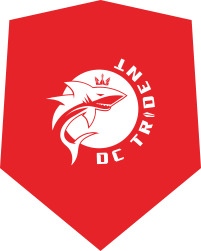

DC Trident (63%) over LA Current (37%)
This one started out close but the outcome became pretty clear early on. The Trident makes the semifinals for the second straight year, while the Current once again drop out in the first round.
Commenters were still critical of the Trident’s lack of a… well… trident. (Though you can definitely view the shark’s crown as a trident). The shark is the most obvious A+ choice for an animal-based aquatic team, so much so that it’s a little surprising we don’t have any teams explicitly named the Sharks. Maybe there’s an overlap concern with the NHL hockey team?
Color scheme is an advantage for DC. When you look at the whole bracket, the DC logo jumps out. Why? Because the red pops, and the only other reddish logo in the mix is the Energy Standard logo which has been dead last in every poll it’s ever competed in.
The blue/yellow Current scheme definitely has potential. But it doesn’t quite pop off the bracket, and it also fights a very similar color scheme from a team based in the very same state.
A few reader comments:
- ” I just don’t really understand the trident logo at all; why is there are a shark? There’s not even a real trident.” -Jonathan Charbroiled Steak
- “Sharks crown is a Trident. I actually like it. It is a logo that feels pretty uniquely ISL.” -MDE
- “Current vs trident is another vote between which is worse.” – IU Swammer

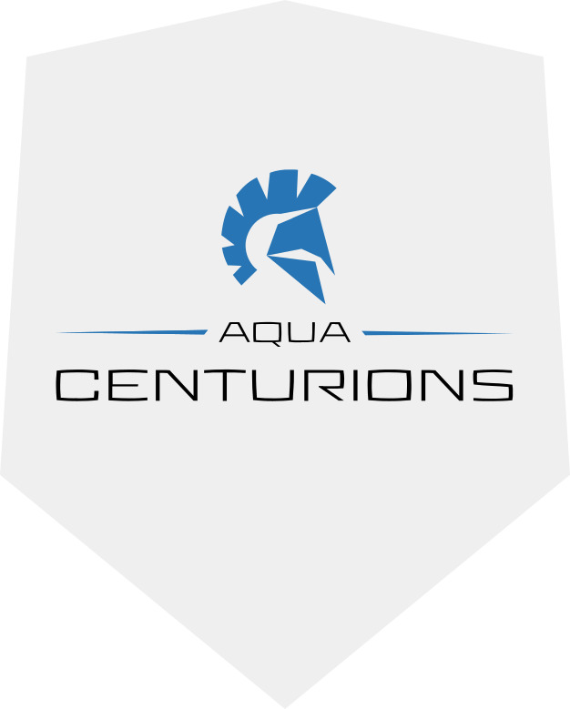
London Roar (82%) over Aqua Centurions (18%)
The London Roar were last year’s runners-up in this bracket, and they look primed to make another deep run. The plusses for London: the animal logo (and a clearly cool animal in the mold of the shark or rhino), the unique color scheme (the only primarily green logo in the mix, though Tokyo may turn out to be more green than black based on the Frog mascot), and positive branding after last year’s strong in-pool performances.
The Aqua Centurions once again drew a tough matchup – they were bounced in the first round last year by eventual champions New York. But the Italy-based franchise also has a pretty uninspiring logo, and the mostly-white background just causes it to get lost both on our bracket and on swim caps.
- “The London Roar logo looks good and well crafted, while the Centurions logo, as someone said last year, doesn’t stand out and looks kind of like a PowerPoint template.” -swimfan210_
- “Roar has got the best logo overall” -Colt Simonelli
- “[London] Looks like a cricket team logo.” -MDE

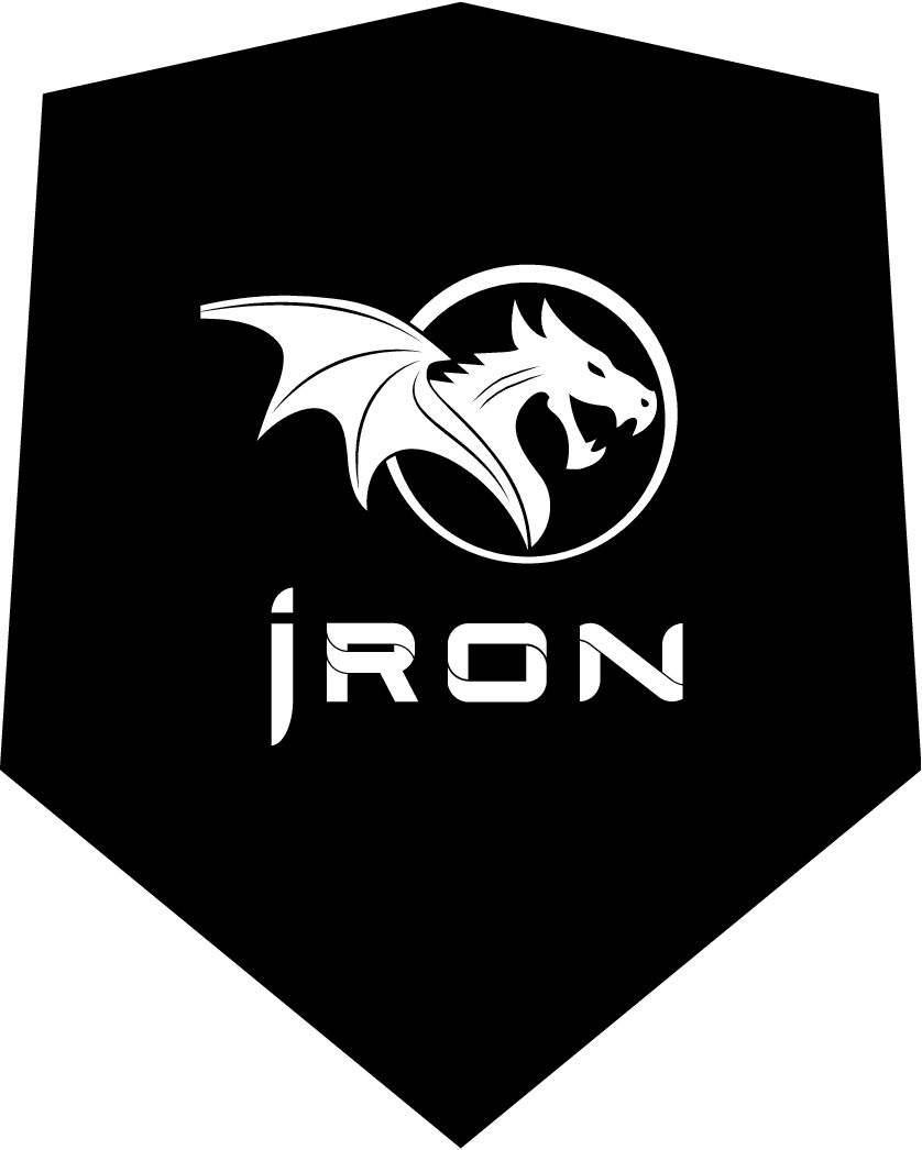
Cali Condors (52%) over Iron (48%)
An absolute nailbiter that shows the vast improvements in the Iron logo from last year. The dragon is a very cool addition, and puts Iron in the same class as DC when it comes to animal logos: not technically an animal-themed team, but with a clear, compelling animal mascot to lean on.
Iron and the Breakers have the exact same color scheme, last year hitting the black/silver mix and this year honing in on a stark black/white combo. It feels like a pop of color is missing for both, but it’s also clear that nine of the ten ISL teams stuck to a strict two-color format in these logos.
A few reader comments:
- “The Iron logo is so metal that Michael Klim and Ian Thorpe might join the team just to rub it in Gary Hall Jr.’s face.” -Willswim
- “Maybe make the dragon red or something and it might put it over the top.” -SCCoach
Consolation Matchup
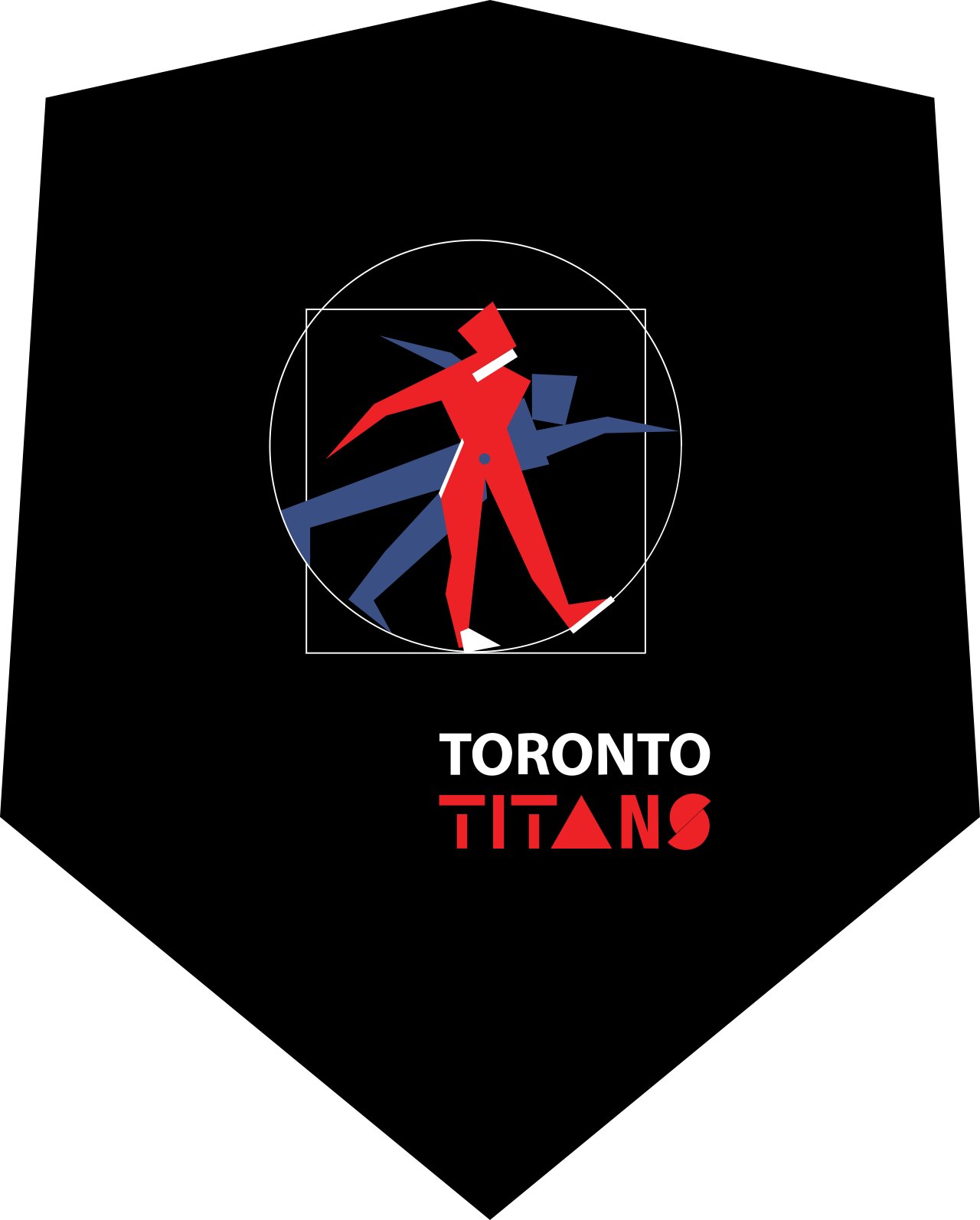
Toronto Titans (51%) over Energy Standard (49%)
This one actually got closer than any other matchup, though apathy also reigned supreme – this poll got far fewer votes than any of the quarterfinal matchups.
That the Titans logo managed to win after taking so much shade from commenters really speaks to how disliked the Energy Standard logo is.
One odd tidbit: while many of the other logos have gotten feedback about how much a third color would help (Iron, Tokyo), Toronto is the only team in the league with three colors in its logo… and it’s also one of the bottom two logos. For what that’s worth.
A few reader comments:
- “energy standard sounds like an oil company and the logo matches that perfectly” -Seamus Cavanaugh
The Bracket

Round 3 Matchups
Semifinals
NY Breakers vs DC Trident
Which ISL team has the better logo? (Semifinals)
- NY Breakers (61%)
- DC Trident (39%)
London Roar vs Cali Condors
Which ISL team has the better logo? (Semifinals)
- Cali Condors (51%)
- London Roar (49%)
Consolation Bracket
5th-through-8th Place Poll
Which ISL team has the best logo (5th Place Consol)
- Tokyo Frog Kings (60%)
- Iron (28%)
- LA Current (7%)
- Aqua Centurions (6%)
so the NY Breakers were the best logo and the worst team in Season 1?
This is a travesty. The Frog Kings are so clearly superior, I don’t understand what happened. I will absolutely be looking for merch even though I’m rooting for the Condors.
Who didn’t vote for Frog Kings???
The Breakers won with postal ballots. I do not accept this. Not a fair vote. Very bad. A bad rhino vote. A good frog vote.
When you look at it, and I have brilliant people looking at this, the brilliantest, frogs win when you take away the votes that didn’t vote for them. So frogs win.
Toughest here is definitely London v California. They both look regal and epic, but I’ll take London because I like their lions better than whatever is going on in the middle of the Cali condors.
All hail the hypnotoads.
The “real” championship was last week between the Breakers and the Frog Kings.
Toughest choice this week is between the Condors and the Roar. Very similar concept, but I give the edge to the Condors since condors are sort of acquatic, and because I associate condors with California more than I associate lions with London.
I’m not sure I buy that Condors are aquatic lol. Maybe aeronautic.
London and Lions – London’s pro men’s basketball team, who were the 2018-2019 British Champions, are actually called the London Lions. The Lion is also the national animal of England. The Royal Arms of England has 3 lions on it. There is actually a very, very long connection between England and Lions.
That being said, I also slightly prefer the Cali logo. If you told me they were designed by the same person, I’d believe you. I like the particular shade of blue and gold chosen by Cali more than I like the gold of the London logo, and I think the Cali logo is a little more… Read more »